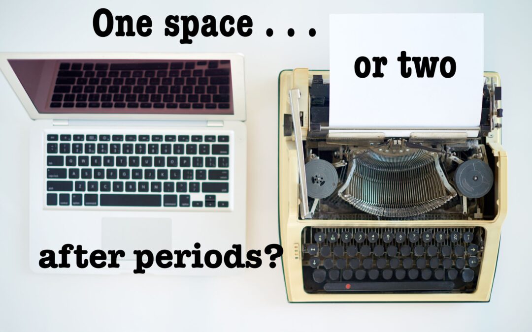
Do you insert one space or two after a period? Many people are surprisingly (even absurdly) passionate about their preference, yet this seemingly minor issue is not nearly as cut-and-dried as it may at first appear.
A Little Background on a Longstanding Debate
The one-space-versus-two controversy has raged throughout the history of printing. As Jim Felici notes, this debate can be traced back even to the Declaration of Independence and to early versions of the Judeo-Christian Bible. A quick online search reveals that it continues to be a hot topic.
For many years, I believed (and even stated in this blog) that the two-space convention arose after the introduction of the typewriter, in response to its lack of proportionally spaced characters. With this new machine, all letters, numbers, and symbols were “monospaced”: they each took up the same amount of real estate on the typewritten page, an arrangement that resulted in more space between skinny characters (such as the letter “I” and the number “1”) than between wider ones (such as the letters “M” and “W”).
According to a broadly circulated argument, inserting more space after end punctuation came about to ensure that readers could easily spot the end of one sentence and the start of another, since that gap would be larger than the gaps surrounding narrow characters.
I have since learned that this theory is full of holes.
Another closely related but equally specious belief held that book publishers have always employed only one space after periods. Not true.
In an article appearing in its Shop Talk series, the very reputable Chicago Manual of Style (CMOS) dispels these myths and others that commonly appear in discussions about spacing after end punctuation. (If you’re looking for an even deeper dive, this article by an artisan book publishing company makes a compelling case for the notion that spacing decisions have always been largely arbitrary, having little to do with font size, typewriter limitations, or printing traditions.)
The Two-Space Camp
Most (but, as we will see, not all) people who favor two spaces learned to type on a typewriter, and a rule acquired many moons ago is often deeply entrenched and difficult to shake. But those who stick to it may be doing so not merely out of habit or even sheer stubbornness: some insert two spaces because they believe that this end-of-sentence visual cue renders their texts more readable.
In 2018, our “two-spacers” gained meager support from researchers who claimed that reading comprehension improves slightly with the additional space. Though their study was not terribly persuasive, it nonetheless elicited some strong opinions, as reflected in this article in The Atlantic.
The One-Space Camp
Those who favor one space likely learned keyboarding on computers, and in this modern, screen-based environment, two spaces are usually deemed unnecessary and even distracting.
Some “one-spacers,” in fact, can be extremely dismissive of their two-space counterparts, as evidenced in this article, enlightening not only for its lack of nuance but also for the heated responses expressed in the comments.
So What Do I Advise?
For the past forty years, I’ve inserted only one space after sentence-ending punctuation (also known as terminal punctuation). When all is said and done—and even after we dispense with the false information and historical myths swirling around this issue—holding on to the two-space convention many of us learned decades ago is difficult to justify. (And be aware that editors routinely remove double spaces from documents intended for publication.)
That said, if you feel strongly about using two spaces, be consistent throughout any single document. Readers may become distracted (if only subconsciously) by spacing that fluctuates, and text that is consistently spaced is more aesthetically pleasing.
It’s also helpful to consider other factors:
- If you choose a monospaced word processing font (such as Courier New, Lucida Console, or Andale Mono), you might gain some readability by using two spaces.
- As far as I know, most (if not all) style books advocate the one-space approach. However, if your workplace has an in-house style manual or adheres to a particular style (e.g., MLA, APA, AP, Chicago), then you should stick to the guidance provided by that resource.
Old Habits Die Hard
Regardless of how or when you picked up the two-space habit, it may prove more challenging to shed—should you wish to do so—than you anticipated. Luckily, word processing software provides tools to assist with your transition to the single-space side:
- Microsoft Word’s punctuation settings can be configured to flag sentences followed by two spaces; see the CMOS article mentioned earlier for easy step-by-step instructions.
- When using a proportionally spaced font, I avail myself of my software program’s global find-and-replace function to search for all instances of two spaces in a document and replace them with one. The process takes about three seconds and ensures consistency.
(If you’re eager to tackle another hackle-raising issue, head on over to a post about the Oxford comma.)
Copyright 2002 Get It Write. Revised 2018, 2023.
Hi, Nancy,
This is a very interesting article. Although I learned to type on a manual typewriter (with blank keys, no less) in high school in 1962, I made the leap to using a single space after periods around 15 years ago. Our church secretary, who is in her early 50s, uses two spaces. I edit all our church bulletins and have been tempted to use a global replacement to change double space to single space, but I just leave well enough alone. One might think that because of our ages, the opposite would be true.
What is old this abaut.?
I been traing to see.. but
Its always. Take me away
From the truht..?i only want to hear why..please i need to know.. what i kan do.?